
Overview
I created a brand kit to help Artservatorey's director easily create beautiful, professional, and consistent social media posts and graphics
Artservatorey is a growing non-profit providing fine arts education and enrichment to underserved students.
Role
Lead designer
Timeline
Ongoing
Collaborators
Artservatory director, web designer
Deliverables
Logos, brand guide, digital marketing materials
Problem Statement
Artservatorey struggles to create digital media that conveys their lighthearted, yet professional identity
Artservatory's director runs the non-profit alone, and has no prior design background. She feels her lack of design skill hinders the authority and professionalism of the non-profit's official social accounts.
Refining the Logo
I created a refreshed, modern version of Artservatorey's logo to convey the youthful nature of their program
Characteristics covered in our brainstorming sessions included: playful, educational, professional, and kid-friendly.


Softer lines and cartoon-like imagery convey emphasis on young students
Primary colors were previously harsh and were replaced with softer hues that work harmoniously
Using a simple font creates a polished, professional logo
Brand Color Palettes
Building off the new logo, I created color palettes for the brand guideline
I replaced legacy designs with new design system components that offer additional exporting options, table data sorting ability, and improved visual accessibility.
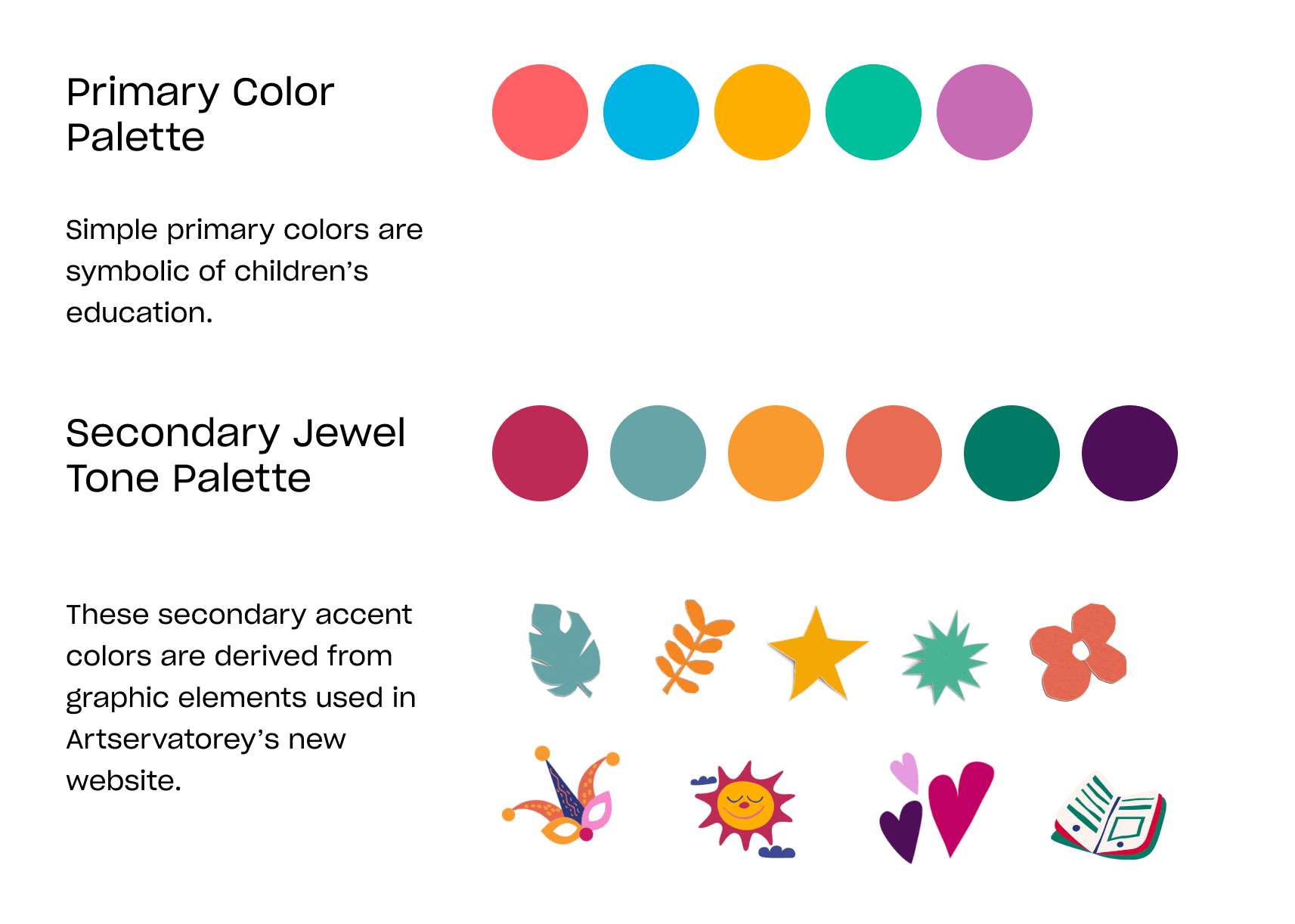
Refreshed logo color palette is more pleasing to the eye
Subtle, jewel tones provide a secondary palette that can be used for text, accents, or backgrounds.
Fonts and text
To create consistency across materials, I identified two main fonts for Artservatorey's brand kit
Lazy Dog is a playful, illustrative font to be used primarily for social media posts emphasizing visuals.
When longer form text is required, Quicksand is to be used for its readability. Both fonts are rounded and convey a warm and welcoming feel.
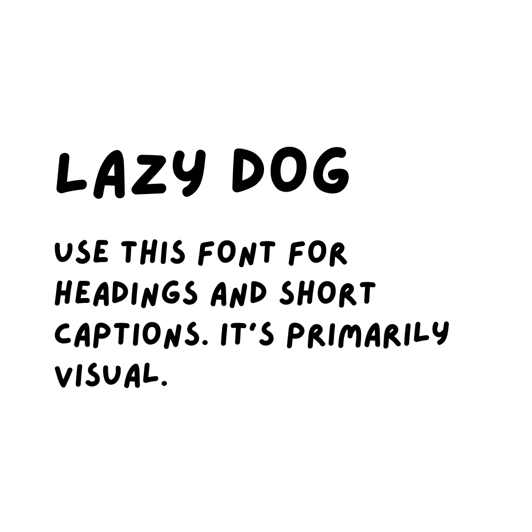
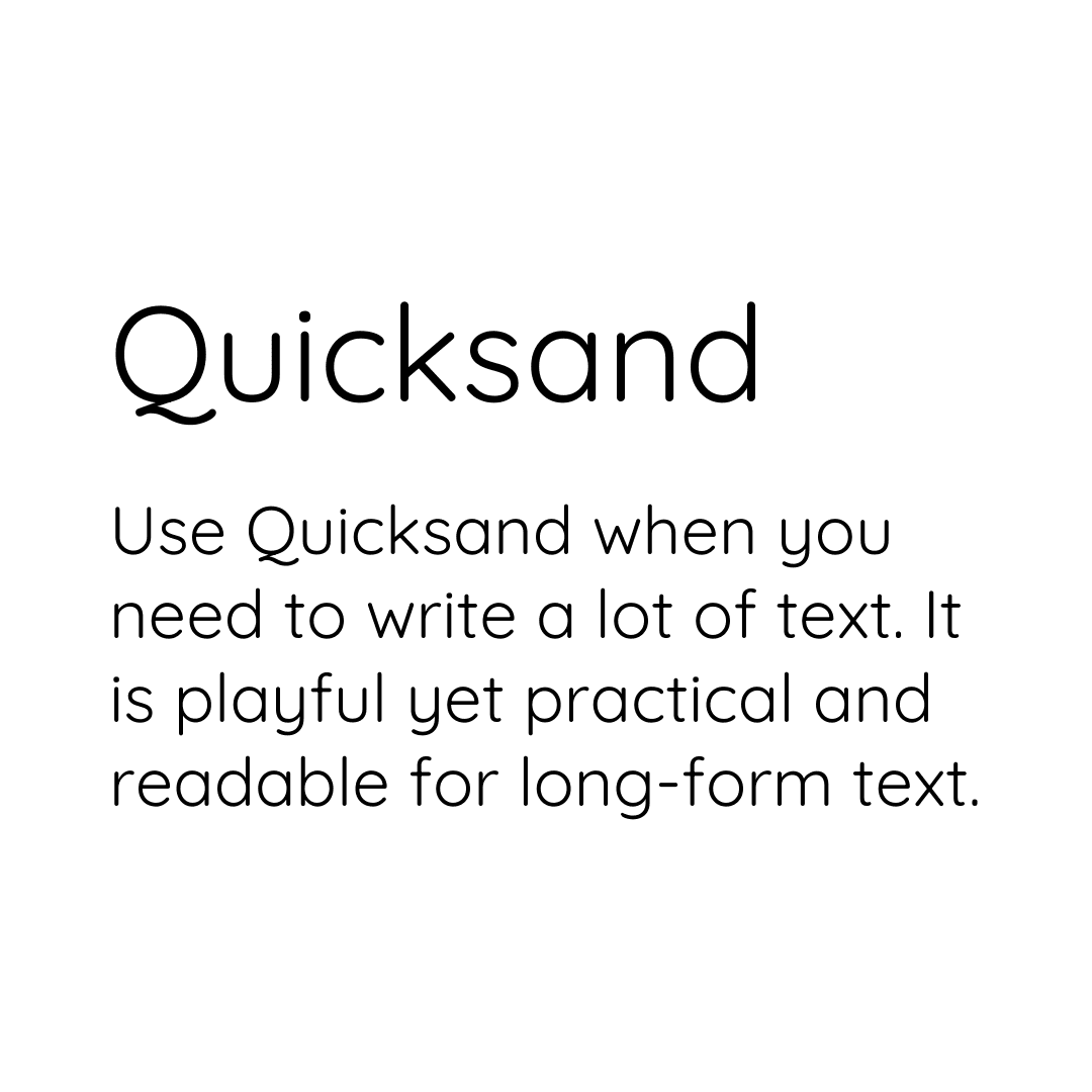
Fonts chosen to create a friendly and approachable look
Rounded edges consistent with the rounded lines and fonts of logo
Photos
The client specifically requested guidance on how to post photos while maintaining a consistent look
I created templates and guidelines to achieve this. Previously, Artservatorey used a different template for every post, creating visual cacophony. Adhering to simple designs assures that posts look organized and professional.


Using multiple photos and over-stylized templates is overwhelming
Instead, I suggested limiting photos to four per slide.


Using more unique templates like the asymmetric template on the left is risky if not used correctly.
Instead, I suggested sticking to minimal designs such as the right, which uses symmetrical squares and does not have overlapping elements.
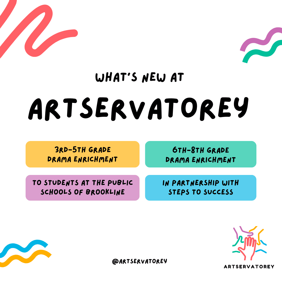
Results
Here are examples of digital graphics provided in the final brand kit
An instagram post I drafted for Artservatorey

I included both the default logo and this version for circular icons.
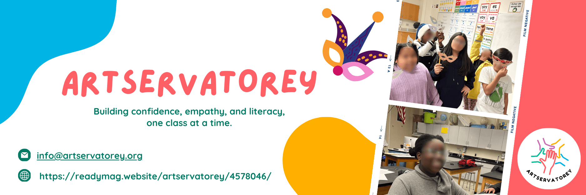
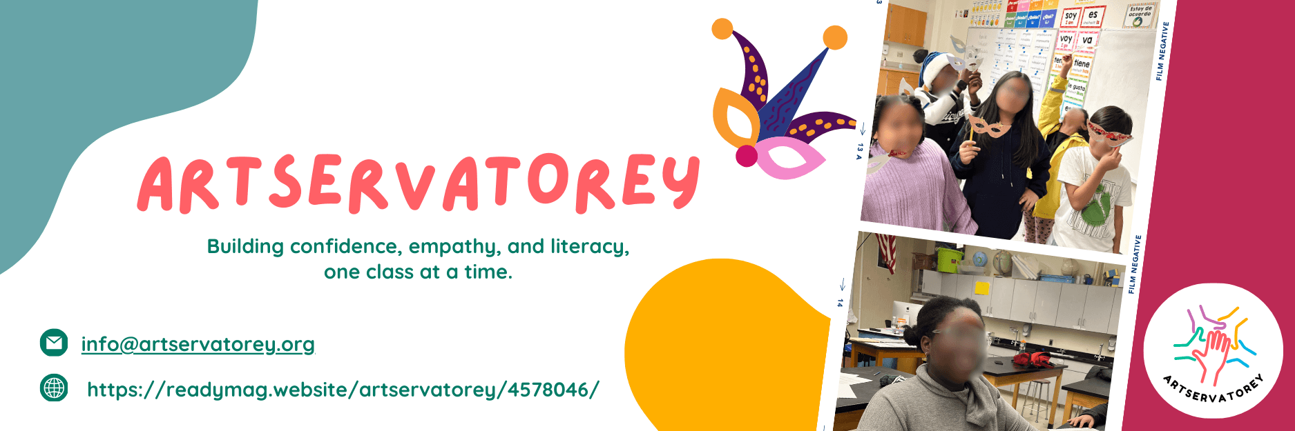
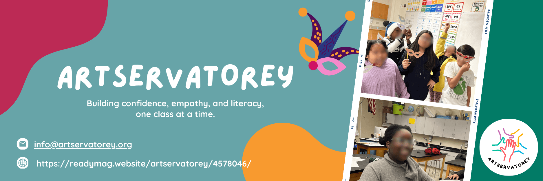
I designed 3 versions of an email header.
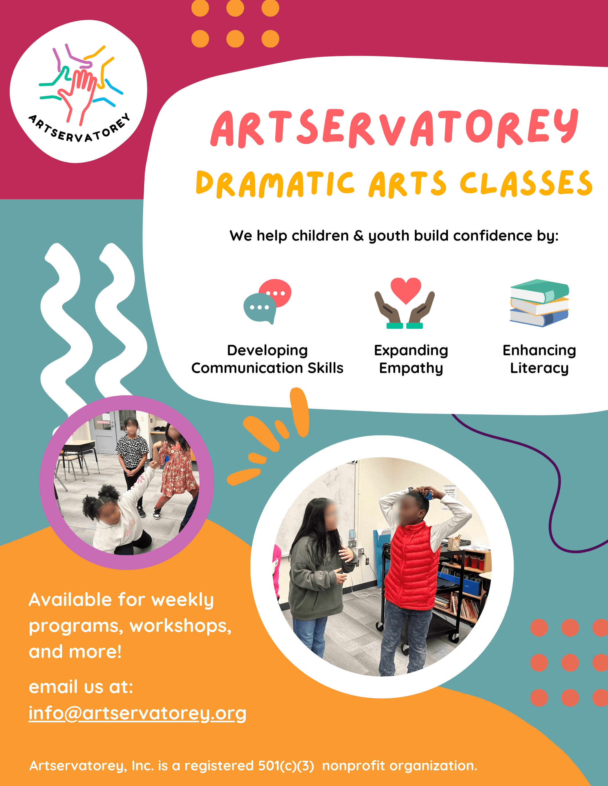
A marketing flyer to be sent to parents and potential partner schools.